Um dir ein optimales Erlebnis zu bieten, verwenden wir Technologien wie Cookies, um Geräteinformationen zu speichern und/oder darauf zuzugreifen. Wenn du diesen Technologien zustimmst, können wir Daten wie das Surfverhalten oder eindeutige IDs auf dieser Website verarbeiten. Wenn du deine Zustimmung nicht erteilst oder zurückziehst, können bestimmte Merkmale und Funktionen beeinträchtigt werden.
Die technische Speicherung oder der Zugang ist unbedingt erforderlich für den rechtmäßigen Zweck, die Nutzung eines bestimmten Dienstes zu ermöglichen, der vom Teilnehmer oder Nutzer ausdrücklich gewünscht wird, oder für den alleinigen Zweck, die Übertragung einer Nachricht über ein elektronisches Kommunikationsnetz durchzuführen.
Die technische Speicherung oder der Zugriff ist für den rechtmäßigen Zweck der Speicherung von Präferenzen erforderlich, die nicht vom Abonnenten oder Benutzer angefordert wurden.
Die technische Speicherung oder der Zugriff, der ausschließlich zu statistischen Zwecken erfolgt.
Die technische Speicherung oder der Zugriff, der ausschließlich zu anonymen statistischen Zwecken verwendet wird. Ohne eine Vorladung, die freiwillige Zustimmung deines Internetdienstanbieters oder zusätzliche Aufzeichnungen von Dritten können die zu diesem Zweck gespeicherten oder abgerufenen Informationen allein in der Regel nicht dazu verwendet werden, dich zu identifizieren.
Die technische Speicherung oder der Zugriff ist erforderlich, um Nutzerprofile zu erstellen, um Werbung zu versenden oder um den Nutzer auf einer Website oder über mehrere Websites hinweg zu ähnlichen Marketingzwecken zu verfolgen.
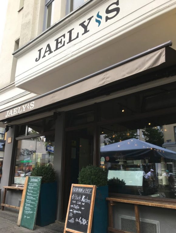
The name of my friend’s restaurant was given and not necessarily easy to read nor to pronounce. On top of that the signage areas on the building’s facade were very narrow. So I decided to focus on the word and letters itself when redesigning the logo.
I wanted them to be bold and readable from far yet elegant and characteristic. A „dot on the i“ was missing but instead I had an apostrophe to work with … which turned out pretty well.
No matter what’s written as long as you see the striking font combined with the petrol coloured symbol, you know it’s Jaely’s 🙂