Um dir ein optimales Erlebnis zu bieten, verwenden wir Technologien wie Cookies, um Geräteinformationen zu speichern und/oder darauf zuzugreifen. Wenn du diesen Technologien zustimmst, können wir Daten wie das Surfverhalten oder eindeutige IDs auf dieser Website verarbeiten. Wenn du deine Zustimmung nicht erteilst oder zurückziehst, können bestimmte Merkmale und Funktionen beeinträchtigt werden.
Die technische Speicherung oder der Zugang ist unbedingt erforderlich für den rechtmäßigen Zweck, die Nutzung eines bestimmten Dienstes zu ermöglichen, der vom Teilnehmer oder Nutzer ausdrücklich gewünscht wird, oder für den alleinigen Zweck, die Übertragung einer Nachricht über ein elektronisches Kommunikationsnetz durchzuführen.
Die technische Speicherung oder der Zugriff ist für den rechtmäßigen Zweck der Speicherung von Präferenzen erforderlich, die nicht vom Abonnenten oder Benutzer angefordert wurden.
Die technische Speicherung oder der Zugriff, der ausschließlich zu statistischen Zwecken erfolgt.
Die technische Speicherung oder der Zugriff, der ausschließlich zu anonymen statistischen Zwecken verwendet wird. Ohne eine Vorladung, die freiwillige Zustimmung deines Internetdienstanbieters oder zusätzliche Aufzeichnungen von Dritten können die zu diesem Zweck gespeicherten oder abgerufenen Informationen allein in der Regel nicht dazu verwendet werden, dich zu identifizieren.
Die technische Speicherung oder der Zugriff ist erforderlich, um Nutzerprofile zu erstellen, um Werbung zu versenden oder um den Nutzer auf einer Website oder über mehrere Websites hinweg zu ähnlichen Marketingzwecken zu verfolgen.
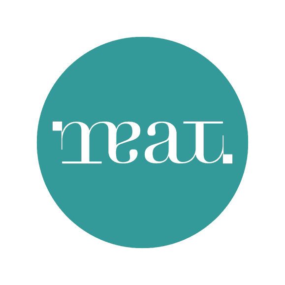
Me and my business partner Sagar Ghoting were assigned to develop the branding for MEAT – an independent art gallery based out of Cairo.
We helped MEAT to present a new perspective on art, and on the Middle East. It allows works of art to be seen in new ways, and to have new effects on the gallery visitor. Any way you choose to look at it, however, MEAT is trustworthy, authentic, and knowledgeable.
This logo is a rotational ambigram, meaning that it is the same whether it is viewed right-side-up or upside-down. Not only does this provide an interesting visual language for future campaigns, but it also has metaphorical meanings that we think will add value to the MEAT brand, and start the gallery off on a strong heading.
The gallery is hoping to be a starting point for conversations between different cultures, particularly between the West and the Middle East. When cultures come together in any sense, both sides are often left feeling that the other side is somehow “backwards” or “upside-down.”
The message of MEAT is that even when another person’s point of view appears to be different, the language of art can make it understood, and can produce common ground.
The upside-down motif can also be used to visually explain MEAT’s goal of changing not only Egypt’s art scene, but the way people think about themselves, their society, and the world. To experience MEAT is to be forced to see every issue from a variety of perspectives and achieve a holistic outlook.
Visually, the logo is designed as a contemporary English language logo with subtle Arabic undertones; elements such as the black squares and the weight of the lines recall Arabic writing without being obviously “Middle Eastern.” Finally, it is based on a classic font, Didot, allowing it to be visually interesting while being grounded, relevant, and timeless.